
Category : Public Service / Charity
Any form of print, digital or broadcast advertising or design for a non-profit or charitable organization.
< Back to Categories
Name:
Brian Ohlmann (Saskatoon)
Organisation:
MGM Communications
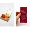
Title:
Appe-teaser
Credits:
Art Director: Brian Ohlmann
Copywriter: Drew Sebesteny
Client:
Persephone Theatre
Client’s Business:
Entertainment
Rationale:
With a great wine list and appetizers from some of Saskatoon’s finest chefs, Persephone Theatre’s Taste of the Arts is one of the premier fundraising events in Saskatoon. To whet the appetite of our audience, we sent word out in the form of appetizers – small printed invites resembling delicious morsels, speared with a toothpick. Patrons were encouraged to bring their appetites… and their wallets.
Name:
Michael Gatioan (Saskatoon)
Organisation:
MGM Communications
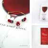
Title:
Reserve Your Glass
Credits:
Art Director: Michael Gatioan
Copywriter: Drew Sebesteny
Client:
Persephone Theatre
Client’s Business:
Entertainment
Rationale:
The Persephone Theatre's annual fundraiser, A Taste of the Arts combines the finest food and drink with an evening of entertainment. As a limited ticket event, we wanted to inspire a sense of urgency and exclusivity. Rather than a plain invite, we hand-crafted wine glass charms (each one unique) to drive home the need to get your tickets (and therefore your glass) early. Guests could then bring the charms with them to the event in order to identify their glasses.
The poster execution continued the flavour of the invites by playing on the fusion of fine wines and theatre.
The poster execution continued the flavour of the invites by playing on the fusion of fine wines and theatre.
Name:
Christopher Dally (Saskatoon)
Organisation:
Ledbetter Communications
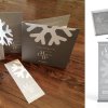
Title:
Mistletoe Charity Ball
Client:
St. Paul's Hospital Foundation
Client’s Business:
an independent body responsible for the fund raising programs and activities in support of St. Paul's Hospital
Printer:
MisterPrint
Rationale:
Given a small budget and the theme of "snowflake", we put together a creative approach to the invitations, programs, tickets, and relating materials for their Annual Mistletoe Charity Ball fundraiser. The design of the invitation is meant to be one that a recipient might display on their desk or in their home. The response was positive and all tickets were sold.
![]()

Name:
Matty O'Connell (Regina)
Organisation:
Look Matters
Title:
Dawn of the Tread - SK Scrap Tire Corp
Credits:
Creative Director: Matty O'Connell
Concept Development: Greg Moore
Client:
SK Scrap Tire Corporation
Client’s Business:
Tire Recycling Stewardship Program
Printer:
Studio 10
Rationale:
Saskatchewan Scrap Tire Corporation has been working to recycle old scrap tires in this province for over fifteen years. As with all environmental stewards, they have a serious message that is important to communicate. We previously worked on a campaign titled “Unsung Heroes “ which was successful in accomplishing its goals for SSTC, but this time they wanted something that was less literal and more eye-popping.
SSTC wanted to create an online video in 2013 with hopes that in 2014, it would be repurposed into a cross-platform advertising campaign. We approached this task with high-level, platform thinking. Having worked with SSTC in the past we were at an advantage in knowing what had been done previously, and what options had yet to be explored. After some brainstorming and vetting we landed on “Dawn of the Tread”. It points to the seriousness of tire recycling in a way that is entertaining to consumers.
Although, the full campaign is set to launch in Summer of 2014, the video was created and shared online in Fall 2013 to start to garner attention, building up to the full release of the campaign.

Name:
Matty O'Connell (Regina)
Organisation:
Look Matters
Title:
SARCAN - 25th Anniversary Banner
Credits:
Art Director: Kaitlyn Rude
Client:
SARCAN
Client’s Business:
Recycling/Environmental Protection
Rationale:
SARCAN’s new “Many Happy Returns” campaign was meant to help express some of the fun-loving spirit that has existed within the SARCAN brand for the past 25 years. Part of this new brand called for the development of a large, 20 foot banner that would hang in all 75 SARCAN depots across the province.
The SARCAN 25th Anniversary Banner was executed in a fun, illustration style that has become an icon in every depot. We didn’t want to create a boring 25th anniversary badge and call it a day. Instead, we chose to tell a little bit of SARCAN’s story and how they’ve had a positive impact on keeping our province green for a quarter of a century.
The SARCAN 25th Anniversary Banner was executed in a fun, illustration style that has become an icon in every depot. We didn’t want to create a boring 25th anniversary badge and call it a day. Instead, we chose to tell a little bit of SARCAN’s story and how they’ve had a positive impact on keeping our province green for a quarter of a century.
![]()
Name:
Tim Neal (Saskatoon)
Organisation:
Tap Communications
Title:
Prohibition Ball
Credits:
Tim Neal (Creative Director) David Melashenko (Art Director) Pamela Cradock (Copywriter) Rebecca Harbin (Designer)
Client:
Royal University Hospital Foundation
Client’s Business:
Fundraising
Rationale:
THE CHALLENGE: Establish a new look and feel for the 2012 fundraiser.
THE BRIEF: Each year the RUHF brings together some of the city’s most influential residents and throws a party of spectacular proportions (known as a Royal Ball). The RUHF committee provided the name and theme (Prohibition Era) and expected a fun and lively visual aesthetic to match their enthusiasm.
THE DELIVERY: The entire party was setup to take place in a Speakeasy with the materials all fashioned around this concept. The invite was a take on the guarded doors typically found at those establishments and featured a diecut openable “door.” The ticket was a diecut flask printed on a silver cast-coat paper that could discreetly fit in a jacket pocket. The program was made to look like a local newspaper and was handed out at the event by actual paperboys.
![]()
Name:
Giles Woodward (Saskatoon)
Organisation:
Kinetic Advertising
Title:
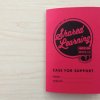
Exercises in Shared Learning
Credits:
Account Manager – Anthony Thoen,
Creative Director – Giles Woodward,
Art Director – Graeme Zirk,
Illustrator – Jamie Tremblay,
Production Artist – Jamie Tremblay,
Copywriter – Kati Phillips
Client:
Kinsmen Club of Saskatoon
Client’s Business:
Non-profit
Printer:
Fastprint
Rationale:
Exercises in Shared Learning is a case for support developed for the Kinsmen Club of Saskatoon (KCOS) to assist with their Shared Learning Campaign. The primary message the case for support had to deliver is that learning changes lives.
The educational background of the primary audience, baby boomers, heavily influenced the overall aesthetic of the case. The document was designed to incite nostalgia so readers would create a personal connection to the document. From the brightly coloured cover and classic (campaign branded) HB pencil, to the tooth and weight of the paper, the case for support was designed to look and feel like a Hilroy workbook.
Question-and-answer copy formatting encourages user interaction creating further connection to the document, and therefore the campaign messaging. Hand-drawn artwork provides an injection of unique personality and makes the document feel like an authentic, personalized school workbook. Each illustration was hand drawn in-house and converted into vector files to be incorporated into layout design.