
Category : Editorial / Magazine
Design layout for newspaper, magazine, newsletters, blogs, enews.
< Back to Categories
Name:
Brian Kachur (Saskatoon)
Organisation:
University of Saskatchewan
Title:
Green and White magazine fall 2013
Credits:
Malary Cloke (designer)
Derrick Kunz (editor)
Client:
University of Saskatchewan
Client’s Business:
Post-secondary education
Printer:
The Lowe-Martin Group
Rationale:
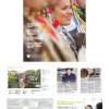
The Green & White has been the University of Saskatchewan’s alumni magazine since 1939. Reaching over 93,000 alumni households, the magazine is produced twice per year—spring and fall—and is distributed the third weeks of May and October.
With an audience that is well educated, affluent and in 117 countries around the world, the magazine has to be informative, reputable and attention getting.
The fall 2013 issue focused on Aboriginal Initiatives, one of the signature areas of the University of Saskatchewan. The magazine covered topics such as an interview with the first Aboriginal U of S chancellor, Aboriginal symbols that were developed for the university and an editorial of the Gordon Oakes-Red Bear Student Centre.
The issue was very well received. Feedback from readers for the 2013 fall issue indicates we are meeting their desire for more information and enhancing the reputation of the university. Comments include:
• “Congratulations on this very interesting and beautiful edition. The content is excellent … and very useful.”
• “I was thrilled to see such a positive issue focusing on Aboriginal alumni. I want to extend my gratitude for your work in putting together the issue.”
Alumni have asked for extra copies of the fall issue to share with friends and colleagues, an indication that we struck a chord with our audience and that our champions are eager to share our story with members of their communities. Also, approximately 100 extra copies were sent to local, provincial and national Aboriginal bands or organizations, strengthening the reputation of the institution, building upon existing relationships and advancing Aboriginal outreach and engagement efforts, a key priority for the U of S.
Project Link:
![]()
Name:
Michael Dymund (Saskatoon)
Organisation:
Title:
Library News Redesign
Credits:
In collaboration with Ryan Schmidt.
Client:
Saskatoon Public Library
Client’s Business:
Public Library
Printer:
printed by Transcontinental Saskatoon
Rationale:
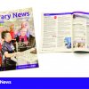
Saskatoon Public Library's program guide, Library News, was redesigned after our centennial in 2013. In addition to reorganzing the content of each issue, the masthead was redesigned for unification with the logo, a new grid system was devised to allow for more flexibility, new body typefaces were chosen, and the section content tables were reworked to aid in the navigation. A more distinct photographic direction has been adopted.
![]()
Name:
Roberta Barrington (Saskatoon)
Organisation:
Verb Magazine
Title:
Verb Magazine Redesign
Credits:
Roberta Barrington (Design Lead), Jessica Patrucco (Managing Editor), Ryan Allan (Editor In Chief), Alex MacPherson (Staff Writer), Adam Hawboldt (Staff Writer), Brittney Graham (Graphic Designer). Various artist supplied photographs for editorial use.
Client:
Parity Publishing
Client’s Business:
Publishing
Printer:
Star Press Inc.
Rationale:
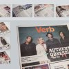
The objective of this redesign project was to take a free weekly arts, music and culture centred publication and rethink/redesign its identity, layout, typographic hierarchy, and ad insertion structure.
We began this project by rethinking the underlying structure of the publication itself, including the baseline grid, new ad sizes, column width, pagination, type size & systems, etc. The main content type size and leading was considered from the beginning in order to be able to ensure an increased word count. It was important that we kept ad client's needs in mind to balance with the content and readership needs. We restructured our advertising insertion sizes to fit together like puzzle pieces within the layout. The development of a new typographic hierarchy was necessary in order to help the reader navigate the magazine in an effective manner. The overall look of the publication was designed to reflect its youthful readership. The end result was a magazine that was a much more clean and subtle weekly medium for arts, music and culture content designed to function as a working template for multiple issues well into the future. This publication design has been in weekly circulation in Saskatoon and Regina since August of 2012.
We began this project by rethinking the underlying structure of the publication itself, including the baseline grid, new ad sizes, column width, pagination, type size & systems, etc. The main content type size and leading was considered from the beginning in order to be able to ensure an increased word count. It was important that we kept ad client's needs in mind to balance with the content and readership needs. We restructured our advertising insertion sizes to fit together like puzzle pieces within the layout. The development of a new typographic hierarchy was necessary in order to help the reader navigate the magazine in an effective manner. The overall look of the publication was designed to reflect its youthful readership. The end result was a magazine that was a much more clean and subtle weekly medium for arts, music and culture content designed to function as a working template for multiple issues well into the future. This publication design has been in weekly circulation in Saskatoon and Regina since August of 2012.
![]()
Name:
Matty O'Connell (Regina)
Organisation:
Look Matters
Title:
TREADS Magazine
Credits:
Art Director: Kaitlyn Rude
Client:
SK Scrap Tire Corporation
Client’s Business:
Tire Recycling Stewardship Program
Rationale:
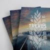
Treads is a seasonal newsletter sent out by Saskatchewan Scrap Tire Corporation each year. It contains updates for each of their programs as well as articles on topics relevant to the corporation and Saskatchewan. Consistency is important for a piece such as this because it’s only released 3-4 times per year. The steady strength of the brand is readily evident for each reader via consistent typefaces and bold formatting. For 2013 a seasonal theme was chosen for the covers to emulate the release date of each newsletter. Each cover photo was chosen and edited accordingly to encourage the familiarity of Treads throughout the year.
![]()

Name:
Jeanie de Beer (Saskatoon)
Organisation:
Createbyfaith Branding & Advertising
Title:
True North
Credits:
Creative Director: Jeanie de Beer
Client:
Cameco
Client’s Business:
Mining
Rationale:
We were approached by Cameco to revitalise and rebrand their bimonthly insert that is distributed in Northern Saskatchewan. This insert is focussed on community development and informing locals on developments in their local areas.
We developed the brand True North
True North is a point on the compass. But it is so much more than that. When you are out camping and you get lost in the woods, finding True North can be really helpful in finding your way back to your camp. Metaphorically speaking, when we lose our way in life, finding True North can be really helpful in redirecting our lives to a more meaningful and intentional phase of living.
True North differs from magnetic north, which varies from place to place and over time due to local magnetic anomalies. A magnetic compass almost never shows true north. In fact over millions of years, magnetic north wanders considerable. Finding True North is essential for accurate navigation. Hence the metaphor. In life’s journey we are often uncertain where we stand, where we are going and what is the right path for us personally. Knowing our True North would enable us to follow the right path. It’s about finding your true goal, figuring out where you really want to go with your life. Is this not what Cameco and the elders of the northern people are wanting for their youth?
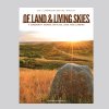
Name:
Tania Wolk (Regina)
Organisation:
Go Giraffe Go
Title:
Of Land & Living Skies
Client:
Saskatchewan Outdoor Environmental and Education Association (SOEEA)
Client’s Business:
not-for-profit organization
Printer:
Fast Print
Rationale:
The Saskatchewan Outdoor Environmental and Education Association (SOEEA) is a not-for-profit organization. They received a one-time grant to do a community journal aimed at outdoor educators/teachers of students of all ages.
VISUAL COMMUNICATIONS CHALLENGE: SOEEA wanted to be “taken seriously” by their funder and the target audience readers. They wanted to get multiple year funding for publishing this journal based on the success of this one. In this category, these journals tend to be highly academic and dense. SOEEA asked us to design a journal that was accessible while honouring the academic relevance of the multiple contributors. They did not want to sell ads: they wanted funding.
THE DESIGN SOLUTION: I gave the journal a magazine-layout, which is non-traditional for this category and which increases the friendliness and accessibility of the publication. In addition, I supported the text with lots of pictures and pull quotes, giving the layout a friendly and easy-to-access feeling. I also used the Rotis serif for the body copy because of its legibility, but also because it is a non-traditional choice for a magazine or journal. Rotis serif gives the publication a different look within its category while having the articles come across as smart and scholarly, but not stuffy or dense.
RESULTS: SOEEA has received multiple-year funding from their main funder as a result of their first issue. Moreover, they have attracted 2 new funders as well; all funders have cited the layout and professionalism of the journal as their reason for supporting it.