
Category : Packaging
Three dimensional delivery of branding. Any type of packaging or labels including those for food, products and music.
< Back to Categories
Name:
Christopher Dally (Saskatoon)
Organisation:
Ledbetter Communications
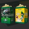
Title:
SaskCanola / Roughriders Popcorn Bag
Credits:
Illustration: Brian V Kachur
Client:
SaskCanola / Saskatchewan Roughriders
Client’s Business:
Producer Led Agricultural Organization / Best football team in the world
Printer:
ColorAd
Rationale:
SaskCanola and the Roughriders partnered to provide fans with popcorn made with 'heart healthy' canola oil. Half the bag was designed to promote Canola oil and it health benefits. The other side was to promote the Roughriders star players (Durant and Sheets) and to promote the sale of their Series 3 Shares. The design had to be flexible to fit on three varying sizes of bags. The idea was that the bag would be something that fans young and old would appreciate and even collect from year to year.
Name:
Jeanie de Beer (Saskatoon)
Organisation:
Createbyfaith Branding & Advertising
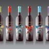
Title:
Stellenbosch Family Wines
Credits:
Creative Director: Jeanie de Beer
Illustrator: Rina Noto
Painting: Michelle-Lize van Wyk
Copywriter: Gillian D'achada
Client:
Stellenbosch Family Wines
Client’s Business:
Boutique Winery
Rationale:
This traditional Stellenbosch, South African winery decided to enter the Chinese market. The challenge was to marry a typical South African cultivar and the integrity of this wine with packaging that would appeal to an Asian audience. The fenguang illustration speaks of legacy as it rises again and again, from its own ashes to bring continuity as well as being a positive relevant symbol to the Asian market it is aimed at. This bird perfectly symbolises the concept of legacy that lies at the heart of Stellenbosch Family Wines. It also lends itself to a traditional visual interpretation – the animal at the heart of a ‘family’ crest, with the family being Stellenbosch Family Wines.
Name:
Catharine Bradbury (Regina)
Organisation:
Bradbury Branding & Design
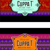
Title:
Cuppa T' Labels
Client:
Cuppa T'
Client’s Business:
Retail tea shop
Rationale:
These labels were designed to adhere to retail, online and home party tea kits. Because there wasn't a budget to design the entire package, and because the contents of each package was unique, the labels had to provide a strong personality to build consumer awareness. In addition, the design had to be strongly identifiable and adaptable to a family of upcoming products and kits. Each label also required a somewhat unique design for product differentiation.
Name:
Giles Woodward (Saskatoon)
Organisation:
Kinetic Advertising
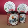
Title:
Fill The Plate
Credits:
Account Director - Chris Kleiter,
Creative Director - Giles Woodward,
Art Director - Graeme Zirk,
Production Artist - Jamie Tremblay,
Copywriter - Kati Phillips
Client:
The Friendship Inn
Client’s Business:
Non-profit
Printer:
Fastprint
Rationale:
Fill the Plate donation bins were developed as a grassroots strategy to garner donations for the Friendship Inn in Saskatoon. Our goal was to encourage donations of any value from the community by communicating that only five dollars can feed a person for an entire day.
The bins were constructed from up-cycled materials, such as coffee cans and paper plates, that are used on a daily basis at the Friendship Inn.
The bins were constructed from up-cycled materials, such as coffee cans and paper plates, that are used on a daily basis at the Friendship Inn.
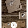
Name:
Hal Schrenk (Saskatoon)
Organisation:
Hal Schrenk Graphic Design
Title:
Honeycomb
Credits:
Creative Director / Album Package Design / Photography: Hal Schrenk
Client:
Carrie Catherine
Client’s Business:
Entertainer
Printer:
Novatex
Rationale:
Carrie Catherine was not only releasing a new one person play, but a music CD to accompany it. The production, entitled “Somewhere Saskatchewan”, was about a woman who found a new home in small prairie town and started an artistic revolution in that hamlet. The main character “Izzie” had taken a bee keepers job in the town, and so it seemed fitting to name the CD “Honeycomb”. In keeping with the grassroots theme of the play the CD packaging was locally hand printed and hand assembled. The little bee icon was custom illustrated, as was the cover wordmarks (stamps were also manufactured of both the wordmarks and icon for additional print material). An ordinary cardboard stock was silk-screened with a honey varnish and then black and white ink. The cork that holds the CD in place was custom die cut and adhered the board, The peek-a-boo honey comb shapes added a little wimsy to the look.
Project Link: