
Category : Environmental / Exhibit / Signage or Graphics
Any extension of a brand into a physical space. Examples include temporary or permanent signage, exhibits, POP display, interior graphics, wayfinding, wall graphics etc.
< Back to Categories
Name:
Michael Gatioan (Saskatoon)
Organisation:
MGM Communications
Title:
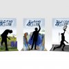
Biggest, Fastest, Strongest Displays
Credits:
Art Director: Michael Gatioan
Client:
SaskTel
Client’s Business:
Technology
Rationale:
Rather than just telling people about the speed and reliability of SaskTel's new 4G LTE network, we wanted to let them experience it for themselves. As part of a larger travelling event display, we created a series of comparison tests that allowed users to see the difference firsthand, the primary activity for which was taking a picture and uploading it to a site. These displays were created as interactive photo backdrops that gave customers a chance to interact with caricaturized versions of the benefits of SaskTel LTE – Bigger, Faster and Stronger.
Name:
Matty O'Connell (Regina)
Organisation:
Look Matters
Title:
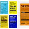
SARCAN - Big 6 Store Signage
Credits:
Art Director: Josh Koester
Client:
SARCAN
Client’s Business:
Recycling/Environmental Protection
Rationale:
Internally, SARCAN has 6 signs that are located in every SARCAN depot across the province. These signs, refereed to internally as the Big 6, contain all of the important information that visitors and guests of SARCAN need to know in order to have an efficient and successful trip to the depot. With this being the case they needed to stand out!
By combining the new SARCAN brand with some exciting and vibrant colours, fonts, and contemporary artistic layout we were able to make the “Big 6” pop off of the traditionally white walls of the SARCAN depots. By leveraging this neutral white, the Big 6 fly off of the walls, screaming for attention. If you walk into SARCAN depot today, you will very quickly recognize the Big 6, making sure to listen to their instruction.
By making the Big 6 loud and consistent, we made sure that the most important information for visitors is quickly consumed. After all, when people visit a SARCAN depot, pop is usually what they expect to find isn’t it? Why should the Big 6 be any different?
![]()
Name:
Matty O'Connell (Regina)
Organisation:
Look Matters
Title:
SARCAN 25th Anniversary Banner
Credits:
Art Director: Kaitlyn Rude
Client:
SARCAN
Client’s Business:
Recycling/Environmental Protection
Rationale:
SARCAN’s new “Many Happy Returns” campaign was meant to help express some of the fun-loving spirit that has existed within the SARCAN brand for the past 25 years. Part of this new brand called for the development of a large, 20 foot banner that would hang in all 75 SARCAN depots across the province.
The SARCAN 25th Anniversary Banner was executed in a fun, illustration style that has become an icon in every depot. We didn’t want to create a boring 25th anniversary badge and call it a day. Instead, we chose to tell a little bit of SARCAN’s story and how they’ve had a positive impact on keeping our province green for a quarter of a century.
The SARCAN 25th Anniversary Banner was executed in a fun, illustration style that has become an icon in every depot. We didn’t want to create a boring 25th anniversary badge and call it a day. Instead, we chose to tell a little bit of SARCAN’s story and how they’ve had a positive impact on keeping our province green for a quarter of a century.
Name:
Roberta Barrington (Saskatoon)
Organisation:
Spareparts
Title:
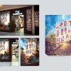
Hit The Road Window Display
Credits:
Roberta Barrington (Visual Designer), Ben Lamothe (Creative Director), Ryan Beaudry (Graphic Designer), Maile Crowe (Documentation Photographer). Composite artwork photography courtesy of Shutterstock, Herschel, Brixton, Nixon & Dakine.
Client:
Spareparts
Client’s Business:
Retail
Printer:
Run Digital
Rationale:
This window display concept was designed to spark excitement for the upcoming music festival and road trip season as well as purchasing stylish accessories to compliment a summer full of great experiences. The concept creative is based on vintage postcard typography and aesthetics combined with a make-believe road trip fantasyland scene. The products placed in the display are meant to resemble a hitchhikers collection of well-travelled goods, waiting on the side of an abandoned dirt road for their next mode of transport, and ultimately their next destination: the music festival. Careful consideration was given to measurements of all elements of each window, products placed within, and the direction of environmental lighting in order to guarantee and direct a successful remote application of each kit (window cling, floor decal, background vinyl, props, and product).
The creative was applied to six different window spaces and interior store signage across western Canada.
The creative was applied to six different window spaces and interior store signage across western Canada.
![]()
![]()
Name:
Steven Safruik (Regina)
Organisation:
Bravo Tango Advertising
Title:
Bravo Tango - Wall Mural
Credits:
Design: Bravo Tango Advertising - Scott Hysuick
Client:
Bravo Tango Advertising
Client’s Business:
Advertising and Design
Printer:
Imagination Ink
Rationale:
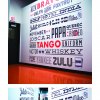
Objectives
People often want to know where the name ‘Bravo Tango’ came from, and they are always delightfully surprised to learn that the name derives from our founder’s name, in the phonetic alphabet – Bravo for Ben, and Tango for Tingley. People will often then try to decipher their own name in the phonetic alphabet. So in order to help connect the dots, we designed a visually appealing, large format wall decal depicting the entire alphabet, phonetically. We also added in fun symbols to make the wall more engaging and curious. For example, beside “Mike” you’ll find a bitten ear (Mike Tyson), and beside “Oscar” you’ll find an Oscar ®. The design met two objectives – to explain the background of our name, and to establish a first impression based on fun, creativity and relaxation.
People often want to know where the name ‘Bravo Tango’ came from, and they are always delightfully surprised to learn that the name derives from our founder’s name, in the phonetic alphabet – Bravo for Ben, and Tango for Tingley. People will often then try to decipher their own name in the phonetic alphabet. So in order to help connect the dots, we designed a visually appealing, large format wall decal depicting the entire alphabet, phonetically. We also added in fun symbols to make the wall more engaging and curious. For example, beside “Mike” you’ll find a bitten ear (Mike Tyson), and beside “Oscar” you’ll find an Oscar ®. The design met two objectives – to explain the background of our name, and to establish a first impression based on fun, creativity and relaxation.