
Category : Poster
Printed picture, placard or bill posted in a public place as an advertisement.
< Back to Categories
Name:
Deborah Clague (Saskatoon)
Title:
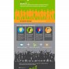
What is a Polytechnic?
Client:
SIAST
Client’s Business:
Education
Printer:
SIAST in-house printing services
Rationale:
After evolving to a polytechnic, it was essential to educate SIAST stakeholders on what the status meant to them and the province of Saskatchewan, Canada.
Name:
Drew Sebesteny (Saskatoon)
Organisation:
MGM Communications
Title:
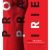
Equivocation Poster
Credits:
Art Director: Drew Sebesteny
Client:
Persephone Theatre
Client’s Business:
Entertainment
Rationale:
When Shakespeare is commissioned to write a tainted account of the Gunpowder Plot (remember, remember, the fifth of November) by a corrupt official, he must decide between a lie and his life. Guy Fawkes, iconic central figure behind the Gunpowder Plot, and Shakespeare bear a striking resemblance, and it's this shared likeness that looms ominously from the dark. But does the repeating phrase that defines the visage read, "the truth is a lie," or "a lie is the truth"?
![]()
Name:
Ryan Schmidt (Saskatoon)
Organisation:
Sparrowhaus
Title:
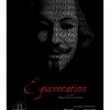
Draplin Poster
Client:
GDC Saskatchewan North
Client’s Business:
Graphic Design Society
Rationale:
Create a poster for an upcoming talk by the larger than life graphic designer Aaron Draplin. Aaron is a big fan of clean thick lines and orange so that is what inspired direction I took with the poster.
![]()
![]()
![]()
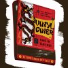
Name:
Craig Medwyduk (Saskatoon)
Organisation:
Odelay!
Title:
Vinyl Diner / Record Store Day 2014
Credits:
Illustration: Odelay!
Client:
Vinyl Diner
Client’s Business:
Record Store
Printer:
Odelay!
Rationale:
The Vinyl Diner is one of 3 notable indepedent music stores located in Saskatoon. To compete for customers on Record Store Day a limited screen printed poster is advertised on Facebook, in-store, and given on a first come first serve basis at the store on RSD.
This has resulted in the Vinyl Diner being the place to go on RSD for added incentives... who doesn't like free stuff?
A 4 colour screen print in-house by Odelay! including a double hit of gold metallic on 130LB chocolate brown paper. The posters is 20.5" x 26" and gorgeous.
This has resulted in the Vinyl Diner being the place to go on RSD for added incentives... who doesn't like free stuff?
A 4 colour screen print in-house by Odelay! including a double hit of gold metallic on 130LB chocolate brown paper. The posters is 20.5" x 26" and gorgeous.

Name:
Natalie Mitchell (Regina)
Organisation:
Title:
Regina Humane Society's Cathy Lauritsen Memorial Golf Classic
Credits:
Natalie Mitchell – Art direction and design
Mike Woroniack/Arcas Advertising – Creative direction
Dan Carr – Illustration
Client:
Regina Humane Society
Client’s Business:
Animal Shelter
Printer:
PrintWest
Rationale:
Every summer, the Regina Humane Society hosts a charity golf tournament to raise much-needed funds for sheltering homeless animals. Our objective was to raise awareness of the golf tournament in a lively and entertaining manner emulating the fun nature of the golf tournament held for a most worthy cause.
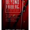
Name:
Matty O'Connell (Regina)
Organisation:
Look Matters
Title:
RCMP HC - Friberg Exhibit Poster
Credits:
Art Director: Kaitlyn Rude
Client:
RCMP Heritage Centre
Client’s Business:
Museum / Heritage Centre
Rationale:
This poster was created to raise awareness and attract visitors to view the “Beyond Friberg” exhibition in the RCMP Heritage Centre’s Feature Gallery. The exhibit explored works from a number of artists apart from Arnold Friberg, who is famous for his iconic portrayal of the Mounted Police. The imagery for this poster was specifically chosen to simulate the premise behind the exhibit. The close up on the Mountie encourages an interest in seeing something beyond the Red Serge. Viewers are inspired with a craving to dig deeper and celebrate the “Mountie” by means of Canadian art.
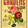
Name:
Catharine Bradbury (Regina)
Organisation:
Bradbury Branding & Design
Title:
New Dance Horizons 2013 Secret Gardens Tour
Client:
New Dance Horizons
Client’s Business:
non-profit
Printer:
Impact Printers
Rationale:
Every year New Dance Horizons, a non-profit arts organization, puts on the Secret Gardens Tour as an annual fundraising event. Bradbury has donated the design of a number of posters and marketing materials for the tour over the years; each one, like the poster presented here, have important impact by being inviting and appealing to all audiences (plus, we've heard they're collectable!).
![]()
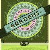
Name:
Catharine Bradbury (Regina)
Organisation:
Bradbury Branding & Design
Title:
New Dance Horizons 2012 Secret Gardens Tour Poster
Client:
New Dance Horizons
Client’s Business:
non-profit
Printer:
Impact Printers
Rationale:
Every year New Dance Horizons, a non-profit arts organization, puts on the Secret Gardens Tour as an annual fundraising event. Bradbury has donated the design of a number of posters and marketing materials for the tour over the years; each one, like the poster presented here, have important impact by being inviting and appealing to all audiences (plus, we've heard they're collectable!).
![]()
Name:
Tim Neal (Saskatoon)
Organisation:
Tap Communications
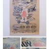
Title:
Heavy Lifting – Poster
Credits:
Tim Neal (Creative Director) David Melashenko (Art Director) Pamela Cradock (Copywriter) Rebecca Harbin (Designer)
Client:
GDC SKN
Client’s Business:
Professional Association
Printer:
NovaTex
Rationale:
The Challenge: Create a poster for the pickiest of all audiences.
The Brief: Make a kick ass poster for an event that is for the best design and advertising in the province... no biggy.
The DELIVERY: The “Heavy Lifting” event theme we developed has several meanings – most importantly it’s about the need for extra effort at some point in the process of creating design and advertising. We wanted the event to be fun, so we developed a quirky “mascot” (AKA - Mucho Macho) and made every element of the design hand drawn to focus on craft and simplicity.
The poster was printed as a limited run 6 colour silkscreen, on recycled kraft paper. The aesthetic was purposefully gritty to provide an obvious hand crafted look and be representative of a “final sketch” where all of the “heavy lifting” (eg. the conceptual work) was complete and which would eventually go to digital.
Name:
Laila Haus (Regina)
Organisation:
Phoenix Group Advertising
Title:
Access Old Fashioned Service
Credits:
Design/Art Direction/Typography: Laila Haus
Writer/Creative Direction: Dustin Panko
Client:
Access Communications
Client’s Business:
Communications
Rationale:
Support the Good Old Fashioned Service campaign in a light-hearted way that recognizes the bathroom isn’t a place you want to learn about internet or television offers — but since Access is renowned for its service, perhaps we can even be of service to you here.