
Category : Writing
Best execution of writing delivered through a Design or Advertising medium. Examples include Ad copy, Radio, Corporate Writing, etc.
< Back to Categories
Growing competition across Co-op’s key business units (food, fuel, home and building supplies and agriculture) created an opportunity for a comprehensive brand strategy and re-introduction.
A multi-year brand renewal and re-introduction strategy was developed, incorporating an updated visual identity guide and ongoing alignment of policies, practices and training programs.
A brand story was created to share the key elements of Co-op’s brand: it’s heritage, it’s direction and it’s key brand values: locally invested, community-minded and lifetime membership benefits.
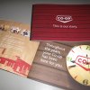
“Co-op: This is our story,” was introduced at a national expo in July 2012 along with a supporting video. The booklet was given to Co-op current and new employees across Canada, board members of the 230 individual retail co-operatives and key stakeholders. It serves as a quick reference guide to explain who Co-op is, what Co-op does, and why Co-op is different.
The primary goals were:
- create increased understanding of the Co-op brand
- create increased pride
- create additional support / alignment among retails and employees of the brand strategy
The booklet has generated great pride among employees and is an important supporting tactic to help Co-op employees and stakeholders understand – and appreciate – the Co-op brand.
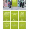
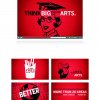
Using bold headlines and our trademark green, we created LRT signage and bus stop posters that appeared in strategic locations in Calgary, close to high schools and other busy stops. It had the desired effect, catching the attention of people who took to Twitter:
@MagduhS: I go to @UCalgary, but I gotta agree the @usask ads around the city are ridiculously awesome
@JacobGadzella: An excellent ad at Lions Park station in #Calgary. Good job #uSask
@LawDeanHolloway (the dean of law at the U of C): The U of Sask student recruiting campaign in Calgary. Very well done!
We also received a shot from the U of C Dinos, who we had targeted in one of the headlines:
At least we can spell Husky #nothuskie
Many of the tweets also included a photo, which meant even more impressions of the ads were captured. And, although not the intended target, people in Saskatoon had the opportunity to share in the campaign as well when it was picked up for a story in The StarPhoenix: http://www.thestarphoenix.com/touch/story.html?id=9743389.
Website traffic from Calgary to the explore site (the student recruitment site) went up over last year during the campaign. In terms of student applications, the number of applicants from Alberta is currently on par from last year, which is a success in a year where applicants from the rest of Canada are down compared to the same time last year.
The guidelines were and continue to be shared with key stakeholders on and off campus, including marketing and communications professionals; leaders such as deans, department heads and directors, all the way up to the President’s Office; and external suppliers that do work for the university.
This project has resulted in increased understanding of the messaging we use when speaking to external audiences, as well as the difference between some of the primary audiences we communicate with. We have received a good deal of positive feedback from our colleagues and continue to see increased understanding of how to infuse our personality into the creative work we produce.
We received the following email from an associate dean in the College of Arts and Science, one of the audiences that are most challenging to engage in branding exercises:
Congratulations on a cogent, compelling guide. I will try to learn and use it.
With good wishes,
David
While the overarching goal was to inform, we also wanted this video to have emotional appeal. After touring the brewery we were inspired by the story of the Original 16 founding members. We thought that juxtaposing the passion and grit of the founding brewers with the typical sports metaphors would be interesting and help not only tell the story of this beer, but also build pride in the brewery. The voice over was written in the style of a pre-game locker room pep talk given by a coach. Using a series of common sports metaphors, we tell the story of how this very special limited edition beer was created, brewed, packaged and delivered to customers. The writing was crafted in such a way that each metaphor speaks both to the determination of the brewery as well as the determination of a sports team. The spot was well received and garnered much positive social media feedback, leading to a 30 second version being cut and played on the MaxTron during Grey Cup.
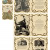
THE BRIEF: Each year the RUHF brings together some of the city’s most influential residents and throws a party of spectacular proportions (known as a Royal Ball). The RUHF committee provided the name and theme (early 20th century carnival/travelling circus) and expected a fun and lively visual aesthetic to match their enthusiasm.
THE DELIVERY: Having developed a softer illustrative style and established a distinct aesthetic, the writing needed to provide the same feel. Through our invitation and event materials, we wanted to take event-goers back in time, immersing them in the old circus experience. We referenced famous stories of circus entertainers, but created entirely new stories of our own for our “star attractions.” Each story and character was developed to be compelling and humourous, while also regionally relevant – rewarding the reader with several inside jokes.
![]()
THE BRIEF: The Saskatoon Public Library (SPL) is a publicly funded library system serving the city of Saskatoon, Saskatchewan, and its surrounding communities. Through its eight locations, SPL provides a variety of materials, programming and services to approximately 222,000 residents of all ages and ethnicity (2011 census). Their extensive collection of materials is growing and changing continually to keep up with the needs of the public. We needed to keep SPL in the public eye, while also drawing attention to their online eBook and eMusic collections, which would promote the convenience factor.
THE DELIVERY: We started with a play on words – “Exact Same Approximate” – we knew the audience would have fun with this concept. We built it up by using a variety of non-traditional examples and some outrageous math. We provided further description on a microsite called splthebeans.ca. Readers who took the bait were treated to fun explanations that were based in scientific fact. Despite the irreverent language and information, the math made sense – approximately. The interaction SPL had with some of their cardholders over the veracity of the statements all lead to a more positive perception of the library.

Organization: SIAST
Entry Title: SIAST Student Recruitment Preview Viewbook
The SIAST Student Recruitment Preview print piece is an easy-to-use reference of program options & guides readers to the SIAST website, goSIAST.com, to learn more & apply. The goal of the project is to produce a visually-engaging, easy-to-read & welcoming reference document with high-quality content.
SIAST provides post-secondary technical education & skills training. The institution serves 26,000 students through 4 campus cities. This print piece is designed as a take-away for high school visits & career fairs; it’s used as reference & to keep SIAST top-of-mind. 17,000 printed
OBJECTIVESFIRST
Create a resource that includes 150 programs, services & campuses in an easy to use, friendly, accurate, organized & helpful to the prospect. Tactics:
i. Simplify the copy with bullets, sub-headings, numbered lists & charts.
ii. Represent all program areas in copy & graphics.
iv. Include real students with hometowns and testimonials.
v. Include an informal activity (word search that relates to the organization).
Accomplished. Copy was rewritten & reorganized to provide a clear flow. Simplicity & bite-size morsels of information was instrumental in making this resource-rich reference book enjoyable to review & easy to digest.
A word search was crafted using words that relate to the organization.
SECOND
Increase the number of applicants by 10%.
Tactics:
i. Within the writing, encourage connection to the website so the target can get full details & apply online.
ii. Create connection to target audience through testimonials.
iii. Created a questionnaire & set up photo sessions to expedite sourcing of authentic quote.
Accomplished. Visits to the application page are up 30% compared to the previous 5 months.