
Category : Illustration
Best execution of illustration delivered through a Design or Advertising medium.
< Back to Categories
Name:
Michael Gatioan (Saskatoon)
Organisation:
MGM Communications
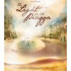
Title:
The Light in the Piazza Poster
Credits:
Art Director: Micahel Gatioan
Client:
Persephone Theatre
Client’s Business:
Entertainment
Rationale:
A romantic tale of a girl finding love on a trip to Europe was the subject of Persephone Theatre’s live performance of Light in the Piazza. Both the piazza and a sun hat play key roles in the performance and are subtly merged together in this illustration, rendered by hand and compiled in Photoshop.
Name:
Jed Sweigard (Saskatoon)
Organisation:
MGM Communications
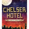
Title:
Chelsea Hotel Poster
Credits:
Art Director: Jed Sweigard
Client:
Persephone Theatre
Client’s Business:
Entertainment
Rationale:
Leonard Cohen has been delighting audiences with his thought-provoking singer/songwriter style for well over half a century. Drawing on the New York skyline as a muse, where the real-life Chelsea Hotel is located, the poster design captures the homemade, down-to-earth authenticity of Cohen's style and the artistic direction of the play. The distressed textures and "crumpled" treatment were inspired by the appearance of a book or album that has been well-loved over many years, just as Cohen’s work has been by fans all over the world.

Name:
Brian Kachur (Saskatoon)
Organisation:
University of Saskatchewan
Title:
Aboriginal symbols
Credits:
Brian Kachur (lead designer)
Client:
University of Saskatchewan
Client’s Business:
Post-secondary education
Rationale:
The U of S has created a suite of 12 custom illustrated Aboriginal symbols to visually represent a culturally diverse and inclusive campus community. “Aboriginal culture has a high respect for symbols,” said Bob Badger, cultural co-ordinator for the University of Saskatchewan.
Extensive consultations were conducted with First Nations, Métis and Inuit leaders across the province to choose and develop the symbols, and a great deal of dialogue with Elders in communities across Saskatchewan was used to identify what symbols to use, and what not to use.
Given the diversity among Aboriginal groups, it was no easy task to select representative symbols. Badger adds, “We believe we have chosen symbols that are visually inclusive; they are very versatile and used in all tribes.”
The custom illustrated U of S symbols have been well received across campus, and their versatile nature means they are easy to apply to a variety of mediums. They have been used in marketing materials ranging from print ads to banners to videos. Future projects include large wall decals and a clothing line.
Name:
Allan Dowdeswell (Saskatoon)
Organisation:
Confidant Communications
Title:
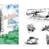
Ajax & Me Illustrations
Client:
Rick Langlais
Client’s Business:
Publishing
Rationale:
Ajax & Me is about the adventures of Gord and Ajax, kids growing up in Northern Saskatchewan, so it is targeted at secondary school readers. The illustrations were used to make the book more enticing for this audience. To save money we used single colour pictures for the interior.
The book contains both serious and light-hearted subject matter, so the illustrative style needed to be appropriate for both. The cover image depicts the scene where two boys in their school uniforms meet Ajax for the first time and end up climbing a tree together.
All three panels of illustrations may be seen at the awards show.
![]()
Name:
Ryan Schmidt (Saskatoon)
Organisation:
Saskatoon Public Library
Title:
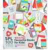
Favourite Books for Kids
Client:
Saskatoon Public Library
Client’s Business:
Library
Rationale:
As part of our centennial celebration, we asked the public to suggest their 100 favourite books for kids. This ad, illustrated with simplified cover images of many popular books, was the call for suggestions. Included amongst the covers are various methods of accessing Saskatoon Public Library’s (SPL) material, such as the SPL card which you can use to access all of these materials for free.
![]()
Name:
Tim Neal (Saskatoon)
Organisation:
Tap Communications
Title:
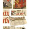
Under the Big Top – Illustrations
Credits:
Tim Neal (Creative Director) David Melashenko (Art Director) Pamela Cradock (Copywriter) Rebecca Harbin (Designer)
Client:
Royal University Hospital Foundation
Client’s Business:
Fundraising
Rationale:
THE CHALLENGE: Establish a new look and feel for the 2013 fundraiser.
THE BRIEF: Each year the RUHF brings together some of the city’s most influential residents and throws a party of spectacular proportions (known as a Royal Ball). The RUHF committee provided the name and theme (early 20th century carnival/travelling circus) and expected a fun and lively visual aesthetic to match their enthusiasm.
THE DELIVERY: Developing on a softer illustrative style, and establishing a distinct aesthetic, the visuals were meant to be a more light-hearted and whimsical take on early 20th century circus advertising. Previous Royal Ball materials were photorealistic and computer graphic driven, so the hand crafted storybook feel was used to make the 2013 event stand out. Various characters were developed and shown throughout the materials to create interesting and subtle story lines.
Name:
Giles Woodward (Saskatoon)
Organisation:
Kinetic Advertising
Title:
Exercises in Shared Learning
Credits:
Account Manager – Anthony Thoen,
Creative Director – Giles Woodward,
Art Director – Graeme Zirk
Illustrator – Jamie Tremblay,
Production Artist – Jamie Tremblay,
Copywriter – Kati Phillips
Client:
Kinsmen Club of Saskatoon
Client’s Business:
Non-profit
Printer:
Fastprint
Rationale:
Exercises in Shared Learning is a case for support developed for the Kinsmen Club of Saskatoon (KCOS) to assist with their Shared Learning Campaign. The primary message the case for support had to deliver is that learning changes lives.
The educational background of the primary audience, baby boomers, heavily influenced the overall aesthetic of the case. The document was designed to incite nostalgia so readers would create a personal connection to the document. From the brightly coloured cover and classic (campaign branded) HB pencil, to the tooth and weight of the paper, the case for support was designed to look and feel like a Hilroy workbook.
Question-and-answer copy formatting encourages user interaction creating further connection to the document, and therefore the campaign messaging. Hand-drawn artwork provides an injection of unique personality and makes the document feel like an authentic, personalized school workbook. Each illustration was hand drawn in-house and converted into vector files to be incorporated into layout design.