Category : Campaign
An advertising campaign featuring the combination of at least three different traditional or digital media.
< Back to Categories
Photo Credits: Tourism Saskatchewan & Stuart Kasdorf
Copywriter Credits: Blairmore Media
A winner of the 2014 Saskatchewan Tourism Awards of Excellence, the ‘Think Again’ campaign for the Waskesiu & Area Wilderness Region (WWR) aims to inform and educate potential customers about the destinations and activities available in the WWR, and reclassifying this area as a true vacation destination for all demographics during all seasons.
Objectives:
- Showcase activities for all 4 seasons
- Promote a variety of experiences that are unique to the area
- Highlight all 4 areas of the WWR: Big River, Lakeland, Prince Albert National Park and Elk Ridge Resort
- Dispel unawareness, misconceptions, and misunderstandings associated with the WWR
Strategy:
The creative behind the campaign blends iconic locations, experiences and imagery (both video and stills) to shatter misconceptions or preconceived notions about the 4 areas within WWR. With this campaign we are asking viewers to reevaluate what they know about the WWR and to “Think Again”.

Because the Huskies are appealing to a different set of audiences and are competing against other sport organizations, we use some different elements. The Huskie eyes are frequently used as a symbol of ferocity, and a jersey texture combined with some grit immediately invokes the sentiment of a tough, fight-to-the-finish mentality.
This campaign intended to market the Huskies as belonging to everyone (because we are all Huskies!) and increasing awareness of the teams while promoting specific events and games. We have seen significant success with our Huskie material, especially with our football attendance, and hockey during the 2013-14 season, which was especially important as we were building up to hosting the 2014 University Cup.
![]()
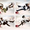
Again, all material was sourced from Midtown Plaza to create a seamless transition from Spring.
After the strong conceptual Spring campaign we wanted to continue in the same tone of strong conceptual, yet very approachable take on Fall fashion.
![]()
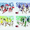
Everything in this campaign was sourced from Midtown Plaza which underlined the idea that being in fashion is attainable to everyone. Throughout the campaign viewers were inspired and encourage to aspire to be fashionable. This aligned perfectly with the new brand positioning that was created.
![]()
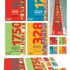
THE BRIEF: The Saskatoon Public Library (SPL) is a publicly funded library system serving the city of Saskatoon, Saskatchewan, and its surrounding communities. Through its eight locations, SPL provides a variety of materials, programming and services to approximately 222,000 residents of all ages and ethnicity (2011 census). SPL has a large and diverse collection of materials, but many people weren’t accessing its services. There was also a lack of knowledge about the breadth and depth of the materials. We needed to create awareness among the population of the city about all the great materials available for free at SPL’s locations.
THE DELIVERY: When researching for the campaign, we discovered the numbers of materials that are brought in to SPL locations every week. These numbers were larger than we had originally imagined, and very surprising. We decided they had to be the focus of the campaign. We designed materials to showcase them and placed them in unexpected places throughout the city. To emphasize the volume above everything else, we created a unique campaign with bright, colourful illustrations that were paired with large graphic numbers. The numbers showed residents just how big the collection is, and how many new materials come in every week.
![]()
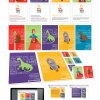
THE BRIEF: The Saskatoon Public Library (SPL) is a publicly funded library system serving the city of Saskatoon, Saskatchewan, and its surrounding communities. Through its eight locations, SPL provides a variety of materials, programming and services to approximately 222,000 residents of all ages and ethnicity (2011 census). Their extensive collection of materials is growing and changing continually to keep up with the needs of the public. We needed to keep SPL in the public eye, while also drawing attention to SPL’s online eBook and eMusic collections which would promote the convenience factor of SPL.
THE DELIVERY: We created an unusual design for the entire campaign in order to catch our audience’s attention at times and in places where they might not have thought of SPL. We created outlandish estimates about the weight, size and volume of their collection. Then we developed budget-conscious materials that would be striking and affordable – and chose places where they could be put up for free and would still reach a large audience. We chose to use coasters as a main delivery point and we partnered with coffee shops and pubs around the city to reach our target demographic relaxes. We used hand lettering to keep the mood of the campaign light, quirky and fun. For the coasters, we used the illustrations on the front of the piece, and put the rest of the information on the back so the audience would have to discover some of the elements for themselves. All the materials directed the audience to a special microsite, splthebeans.ca. The microsite was designed to complement the print materials, while providing more information about the campaign and SPL’s materials and location.
THE BRIEF: The client wanted to get more mortgages and to be seen as the primary financial institution for this product.
THE DELIVERY: Using our intuition, and some secondary research methods, we concluded that the general population in our client’s region liked hunting. And they liked hunting A LOT. We took the premise of “house hunting” and branded it for Synergy. They would start the “House Hunting Season” – they were the literal authority of when you can go out there and “get yer’self a house!”
We made camo out of silhouettes of actual houses on sale in the region – this house hunting camo was developed as a primary graphic throughout the campaign materials and also implemented as corporate attire for the tellers and financial specialists.
The TV and Radio spots played up the typical “manliness” of the hunting season but with an unexpected twist. A series of web-only ads were released during the campaign months showing completely different endings that would target specific demographics.
![]()
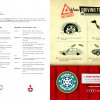
Unsafe workarounds were illustrated in the style of cold war instructional info-graphics and juxtaposed alongside the Academy's aesthetic of high-performance winter gear. Impractical winter driving workarounds were used as comedic ammunition, emphasizing the benefits of modern over antiquated technology.
The online ads were developed as interactive games. The users were able to stop and start the vehicle, thereby avoiding dangerous road hazards. Radio executions were developed to reflect the visual aesthetic of the illustrated campaign materials. Narration style and sound filters were used to provide an old-timey PSA feel in the first half of the ads, providing an audible contrast to the second half of the ads, which incorporated a custom safety alert tone and an authoritative tone of voice.
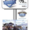
The objective of this campaign was to reach post-secondary students before competitors did with the special “3-4-1 Student Experience” offer over summer, and shift purchase decisions earlier. The custom sasktel.com/student web experience was central to the campaign as all media drove traffic to this website for details. The media mix included online, transit, outdoor, out-of-home and theatre ads, plus a Facebook app and experiential marketing to reach the elusive student.
Appearances were planned at summer events where a SaskTel Street Team engaged the target audience through a “Rootbeer Pong” competition. Participants had a fun SaskTel experience competing for the fastest time to win great prizes. The game was popular and often there were people waiting in line to play. The Street Team promoted the student offer and captured and uploaded players’ times and personal information to a custom-built website. Website traffic increased over the previous year by 22% overall, and by 47% during the critical July–August timeframe. We managed all aspects of this campaign, from the interactive elements to the build of branded Rootbeer Pong tables.