
Category : Annual Report
Print, digital or broadcast annual report/review for any publicly traded, private and non-profit organizations.
< Back to Categories

Name:
Deborah Clague (Saskatoon)
Title:
Impact
Credits:
Photographers: Tom Bartlett, Deborah Clague
Copywriter: Patricia Gillies
Project Manager: Anne Neufeld
Client:
SIAST
Client’s Business:
Education
Printer:
Mister Print
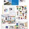
Rationale:
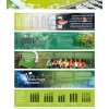
The Saskatchewan Institute of Applied Science and Technology (SIAST) Annual Report details the significant achievements of the post-secondary institute over the previous fiscal year. This includes financial reports and statements, statistics, a narrative that details how strategic themes are being met, and recognition towards students and staff that have achieved individual success. The piece is printed and distributed to over 700 key stakeholders in the province.
The theme of the 2011-2012 edition was “IMPACT”; the goal of the project was to depict the influence that SIAST has on the lives of its students, society and the local economy. Photography and infographics helped achieve this in an engaging manner.
The piece has previously received recognition by winning a 2013 Award of Excellence from the University and College Designers Association
Name:
Brian Kachur (Saskatoon)
Organisation:
University of Saskatchewan
Title:
U of S President's Report
Credits:
Brian Kachur (lead designer)
Teri Parkhurst (lead writer)
Client:
University of Saskatchewan
Client’s Business:
Post-secondary education
Printer:
Mr. Print
Rationale:
Market research showed the University of Saskatchewan, despite being the namesake of a booming province, still deals with old prairie stereotypes. We had a new president who wanted to tell the country about the exciting things happening at the U of S, and we used the 2013 President’s Report to spread our good news, and bust a few Saskatchewan myths at the same time.
Instead of shying away from our stereotypes, we tackled them head-on, made them our headlines, and then going on to prove why they were wrong. A bright, enthusiastic design tied together with our visual elements showed the audience that the U of S is definitely not a dull place to be.
Close to 300 people left feedback through an online form, and comments included:
“The President's Report is filled with facts, details and personnel accomplishment highlights that will amaze all who take time to read this document. It's a "Myth Buster" - we are all familiar with the cliches - thanks for naming them and providing evidence to dispute them.”
“Reading this made me feel a sense of pride that I hadn't really felt before working here. Thank you.”
“What surprised me the most is how entertaining it was to read this report. It was colorful, dynamic and the main points popped out with intelligent and bold statements. Good job catching peoples attention! I am proud to be a student at the University of Saskatchewan.”
“Thank you for shedding light on the progress and plans for our treasured University! After reading this report, I will make a donation, trusting the investment is in good hands.”
Project Link:
![]()
Name:
Josh Nagy (Saskatoon)
Organisation:
SansKernDesign
Title:
Saskatoon Public Library Report to the Community 2012
Client:
Saskatoon Public Library
Client’s Business:
Public Institution
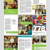
Rationale:
The SPL Report to the Community is an annual publication to inform the community of the actions of the library system for the last year. From a design standpoint, this publication was created to debut the new visual identity for the library system. The report was designed as a showcase.
![]()
Name:
Catharine Bradbury (Regina)
Organisation:
Bradbury Branding & Design
Title:
The Saskatchewan Arts Board Annual Report
Client:
Saskatchewan Arts Board
Client’s Business:
non-profit/government
Printer:
Impact Printers
Rationale:
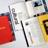
To communicate the impressive fact that the Saskatchewan Arts Board was celebrating its 65th anniversary, it was important to develop a design that was highly visible and communicated that the Arts Board is a leader in cultivating the arts. In addition, the design needed to reinforce the organization’s relevance as it related to its 65 years of experience working with artists, and needed to celebrate the artists and their stories. As a result, a contemporary design with bold typography was chosen. Because the report is content rich, the bold typography served to highlight and layer the information for the reader. An oversized special publication insert highlighting a unique partnership between the Saskatchewan Arts Board and the provincial government immediately positions the Arts Board as innovative and relevant.
![]()
Name:
Catharine Bradbury (Regina)
Organisation:
Bradbury Branding & Design
Title:
The Saskatchewan Archives Board Annual Report
Client:
Saskatchewan Archives Board
Client’s Business:
non-profit/government
Printer:
Impact Printers
Rationale:
The Saskatchewan Archives Board plays an important role in preserving the cultural resources of the province. Because of the obvious historical nature of this organization, a vintage design approach was employed. With a wealth of available imagery, we began illustrating the content of the report with images from their own archives. This resulted in a report that was historically rich and one that definitely stood out from the crowd.
Name:
Tim Neal (Saskatoon)
Organisation:
Tap Communications
Title:
Children’s Hospital Foundation of Saskatchewan 2013 Annual Report
Credits:
Tim Neal (Creative Director) David Melashenko (Art Director) Pamela Cradock (Copywriter) Rebecca Harbin (Designer)
Client:
Children’s Hospital Foundation of Saskatchewan
Client’s Business:
Fundraising
Rationale:
THE CHALLENGE: Develop a corporate document that is seen as more than just the facts and figures.
THE BRIEF: The client was winding down its initial corporate sponsorship campaign, but was still in need of an annual that would maintain interest in its initiatives. The building and its interiors were in the mid-stages of development but construction had still not begun. The focus was to be on the interiors, but the catch was that these hadn’t been constructed yet – and the interior renders to be used as the main imagery were only available in low resolution.
THE DELIVERY: Our concept was to make the annual report into a sticker book. We developed a series of illustrations that were based around the previously made sponsorship campaign characters. We simplified the look of the characters and added a collection of kid friendly items that could be strewn throughout the annual report.
Name:
Erin Sarauer (Saskatoon)
Organisation:
Saskatoon Public Schools
Title:
Saskatoon Public Schools 2012-13 Report to the Community
Credits:
Graphic Artist: Erin Sarauer
Manager, Communications & Marketing: Veronica Baker
Photographer: Rob Kunz (provides the majority of the photos in the report)
Client:
Saskatoon Public Schools
Client’s Business:
Education
Printer:
Mister Print
Rationale:
Our goal with the book is simple: to tell our story. We want our community to know about the innovative, challenging work we are doing with students and for students. However, our objectives are specific to our audiences.
As Saskatchewan’s largest school division with approximately 2,400 staff members, it can be hard for all employees to feel engaged in the work we are doing across the school division and to take pride in our joint efforts. An objective for our 2012-13 report was to share student and staff voices so they feel represented and celebrated.
Another objective of the report is to recognize our existing community partnerships, which include local organizations, civic agencies and education partners. Through such alliances, we are opening doors for our students and broadening their learning experiences. The report provides an opportunity to showcase these partnerships and the benefits for students.
We also set an objective for the public, to understand the contribution our school division is making to our community’s future. By understanding this contribution, we hope it will lead to greater awareness of our successes and further support for our programming.
While we have several longer written pieces, we also wanted to include as many quick highlights as we could. In our planning sessions, we called these “apple bites” and used them to quickly convey an small achievement or highlight. We also felt the inclusion of tweets, not only from our division account but from staff and community members, helped bring more voices into the report and give a broader perspective on our work. It was also suggestive of our division’s focus on using technology to support learning. With this report we also increased our photo count from 66 in our previous report to over 175. The increased number of photos along with the use of “apple bites” help us to tell the multifaceted story of Saskatoon Public Schools.