Category : Brochure / Catalogue / Book / Booklet
Multi-page layout for a product(s), exhibition(s), service(s), publisher(s), institution(s). Single or Series.
< Back to Categories

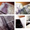
The annual Preview portrays SIAST an an appealing post-secondary destination and showcases the key messages of: breadth of academic program choice; hands-on learning environment; short program length; developing job-ready skills; labour market demand for graduates; and, knowledgeable faculty. As well, the Preview includes an introduction to the variety of academic and other support services that add value to a SIAST education.
It was decided that positive word-of-mouth from real SIAST students, graduates and alumni was priceless in influencing the next generation in choosing SIAST as their preferred place for post-secondary studies. The design that was concepted needed to be able to inject these testimonials throughout the piece without looking forced or like an after-thought.
This piece previously won an IABC Goldquill Award of Excellence.
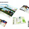
Photo Credits: Tourism Saskatchewan & Stuart Kasdorf
Copywriter Credits: Blairmore Media, Tracey Desjardins & Jenn Mahlberg
Visitor Guide
Have you heard of the Waskesiu & Area Wilderness Region (WWR)? Blairmore Media is helping this new area make itself known! The brand-new destination marketing organization is grounded and ready to attract tourists. Blairmore Media did conceptual creative, design and layout on a Visitor Guide for 2014/15. Using WWR’s birch branding elements, coupled with bold colours to define each individual area within the region, the concept of an earthy, yet bright and attractive guide was born.
The rustic feel of northern Saskatchewan is brought forward in the design of this guide. Birch texture, together with torn parchment creates an outdoorsy feeling. Birch leaves were incorporated as accents to highlight interesting facts about the region. The objective of the design was to give the visitor a taste of the outdoor ambiance they’ll experience when they visit the WWR. This rustic design is contrasted by bright, colourful, activity-oriented imagery to draw focus to WWR activities.
![]()
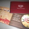
Growing competition across Co-op’s key business units (food, fuel, home and building supplies and agriculture) created an opportunity for a comprehensive brand strategy and re-introduction.
A multi-year brand renewal and re-introduction strategy was developed, incorporating an updated visual identity guide and ongoing alignment of policies, practices and training programs.
A brand story was created to share the key elements of Co-op’s brand: it’s heritage, it’s direction and it’s key brand values: locally invested, community-minded and lifetime membership benefits.
“Co-op: This is our story,” was introduced at a national expo in July 2012 along with a supporting video. The booklet was given to Co-op current and new employees across Canada, board members of the 230 individual retail co-operatives and key stakeholders. It serves as a quick reference guide to explain who Co-op is, what Co-op does, and why Co-op is different.
The primary goals were:
-create increased understanding of the Co-op brand
-create increased pride
-create additional support / alignment among retails and employees of the brand strategy.
The booklet has generated great pride among employees and is an important supporting tactic to help Co-op employees and stakeholders understand – and appreciate – the Co-op brand.

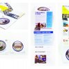
Enter the Pop Can Brochure: this piece was designed to act as a pop can, and like these pop cans, this brochure was jam packed with “the goods”. Using an unconventional folding design, the brochure took to heart the concept of a pop can to communicate its message. And while the concept of a pop can brochure might be unorthodox, the messaging was only made stronger through the execution. Through contemporary design elements that are now found across the entire SARCAN rebrand, the Can Brochure used a combination of vivid imagery and sharp text to tell the story of SARCAN. All in all, this brochure contained within it, the who, what, where, when, why, and how of SARCAN, and most importantly, helped to continue the “Many Happy Returns”.
![]()
![]()
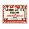
VISUAL COMMUNICATIONS CHALLENGE: Our client told us they wanted a calendar that engaged people on issues regarding food; educated them on global impacts of food production and food security; and inspired them to act without being preachy.
THE DESIGN SOLUTION: We used the concept of presenting the calendar as Farmers’ Almanac-inspired layout. We used this iconic source of agricultural wisdom to highlight the modern problems surrounding food -- the contrast heightens the impact on the reader about how far removed we have become today from traditional food sources and ideas of wellness. We researched almanacs from the past 100 years for style, layout, content, tone and presentation. We scoured bookstores and websites for antique illustrations of food à la almanac-style. AUDIENCE: We considered that the users of the calendar range from people well schooled in international development work and their family members (who may not know as much) to young people (aged 18-29) and Saskatchewan MLAs (Members of Legislative Assembly) who fund SCIC.
RESULTS: In the 10 years SCIC’s been doing calendars, it was the most popular one ever. The client said, “The calendars ‘flew off the shelves’ regardless of printing double than usual [1000].” The client has received dozens of comments that people “have learned new things about food issues every month.”
![]()