Corporate or organization graphic or word mark.

< Back to Categories

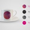
Ledbetter - Aurora Logo Detail
Name:
Christopher Dally (Saskatoon)
Organisation:
Ledbetter Communications
Title:
Aurora - Logo
Client:
Aurora Reproductive Care
Client’s Business:
Reproductive Health Care
Rationale:
The objective was to create a logo that appealed to the target market of women ages 20-40, and represented visually the beginnings of life. The circle (human egg), the inner circles (the multiplying of cells), and the colours all accomplish this.
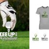
Ledbetter - Teeup Detail
Name:
Christopher Dally (Saskatoon)
Organisation:
Ledbetter Communications
Title:
Tee Up for Agriculture - Logo
Client:
SaskCanola
Client’s Business:
Producer Led Agricultural Organization
Rationale:
The objective was to produce a visually stimulating logo to increase awareness and enrolment for a yearly held producer golf tournament. The logo was created on a small budget and needed to work on a variety of materials.
Rhea - Left Hand Logo Detail
Name:
Rhea Leibel (Regina)
Organisation:
Title:
left hand architecture + design logo
Client:
left hand architecture + design
Client’s Business:
architecture
Rationale:
Encourage the clients to leave creative thinking in their hands.

Award of Merit

Makeroom - Candace Epp Detail
Name:
Nicole Lock (Saskatoon)
Organisation:
Makeroom Design Shop
Title:
Candace Epp Photography Logo Design
Credits:
Photo by Candace Epp Photography
Client:
Candace Epp Photography
Client’s Business:
Photographer
Rationale:
To create a simple and recognizable logo. The intention was to be minimal but clever. The ‘E’ is mirrored so that the ‘C’ and ‘E’ of the photographer’s initials create an abstract icon of a camera. One of the requirements was to create an icon that could be used translucently on photographic work as a recognizable watermark.
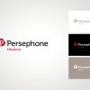
MGM - Persephone Theatre Logo Detail
Name:
Jed Sweigard (Saskatoon)
Organisation:
MGM Communications
Title:
Persephone Theatre Logo
Credits:
Art Director: Jed Sweigard
Client:
Persephone Theatre
Client’s Business:
Entertainment
Rationale:
Theatre has a long-standing tradition of throwing flowers on stage after a particularly impactful performance. The Persephone logo redesign was inspired by this tradition and captures that essence in a symbol that simultaneously resembles a rose while creating a “P” shape in negative space. Mixing the organic treatment of the symbol with a sleek and modern word mark presents a visual representation of Persephone’s personality; contemporary theatre that respects and is inspired by tradition.
Confidant - Ascend Logo Detail
Name:
Allan Dowdeswell (Saskatoon)
Organisation:
Confidant Communications
Title:
Ascend Leadership Project
Client:
Anglican Diocese of Edmonton
Client’s Business:
Religious Organisation
Rationale:

The “Ascend Leadership Program” takes its name from two places, the Ascension of Jesus, and the adventure that is the spiritual life.

Interns in the Ascend Leadership Project (“ALPs”) live together in Ascension House (the rectory of Edmonton's Christ Church Parish) during the project. They participate in activities designed for intentional community, spiritual growth, and leadership development. They also meet regularly with a variety of mentors.

The logo uses mountain imagery to symbolize the climb that each intern takes, ascending in their own development. It also serves as a stylized “A”. The cross in the last word was included as a subtle and persistent reminder of the Christian nature of the project.

OneOlive - Shearwater Marine Services logo Detail
Name:
Cheryl McDougall (Saskatoon)
Organisation:
OneOliveDesign
Title:
Shearwater Marine Services logo
Client:
Shearwater Marine Services
Client’s Business:
Sonar Imagery, Bathymetry, On-water Support, and Waterway Service
Rationale:
To establish Shearwater Marine Services as the source for on-water support and under-water technologies in Saskatchewan and Alberta. Their industrial and military marine experience had to be forefront - with a strong approach that would appeal to local engineers and government.
Natalie M - PRIMEX Training Centre logo Detail
Name:
Natalie Mitchell (Regina)
Organisation:
Title:
PRIMEX Training Centre logo
Credits:
Natalie Mitchell – Art direction and design. Mike Woroniak / Arcas Advertising – Creative direction
Client:
PRIMEX
Client’s Business:
workplace safety training
Rationale:
PRIMEX offers a comprehensive range of safety training programs for a variety of workplace applications.

The logo needed to reflect PRIMEX's core value of providing clients with the most up-to-date safety training presented in a clear and concise manner.

The resulting PRIMEX logo is sturdy, purposeful, practical, direct and decisive.

Award of Merit

Odelay - Indie Ink Publishing Logo Detail
Name:
Jacqueline Germin (Saskatoon)
Organisation:
Odelay!
Title:
Indie Ink Publishing Logo
Client:
Indie Ink Publishing
Client’s Business:
Publisher
Rationale:
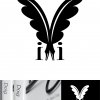
Indie Ink Publishing, like most new startups, needed a logo. This publisher has a philosophy of closely working together with each author as a team, with both publisher and author having the final say before production. This is very different from the traditional publisher and reflects the new paradigm of DIY publishing, but with some professional help.

The identity needed to symbolize tradition but also transformation. It also needed to keep the look of a strong publishing house for the confidence of the authors. To achieve this two fountain pens were used for the tradition side, showing publisher and author coming together, but it also creates a butterfly to reflect the transformation. As well as having two “i”s on either book end to complete the identity in referencing the collaborative nature of the business.

Simple and effective solution, from a book spine to a trade show banner. Odelay! produced a strong logo for this independent Saskatoon publisher.

Award of Merit

CB - Magpies Kitchen Detail
Name:
Catharine Bradbury (Regina)
Organisation:
Bradbury Branding & Design
Title:
Magpies Kitchen
Client:
Magies Kitchen
Client’s Business:
cafe
Rationale:
The name for this business reflects the desire of two identical twins (who are socially gifted), to provide a venue for their delicious and high quality food and beverages. The two magpies in the logo reflect the owners (and their charm) and the design is reminiscent of French patisseries further reflecting their talent for tasty goodies.
CBF - Holly Decker l Makeup Artistry Detail
Name:
Jeanie de Beer (Saskatoon)
Organisation:
Createbyfaith Branding & Advertising
Title:
Holly Decker l Makeup Artistry
Credits:
Graphic Designer: Jeanie de Beer
Client:
Holly Decker l Makeup Artistry
Client’s Business:
Makeup Artistry
Rationale:
Holly Decker is an extremely talented Makeup Artist based in Saskatoon, originally hailing from Vancouver BC. She approached CBF with the need for a new logo to represent her.
This logo had to demonstrate her avant garde take on makeup and also had to place her in the international makeup artistry playing field.
BT - 2014 North American Indigenous Games - Logo Detail
Name:
Steven Safruik (Regina)
Organisation:
Bravo Tango Advertising
Title:
2014 North American Indigenous Games - Logo
Credits:
Design: Bravo Tango Advertising - Dean Fleck
Client:
2014 North American Indigenous Games
Client’s Business:
Sporting Event
Rationale:
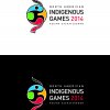
The NAIG 2014 logo incorporates a medicine wheel into the design (circle with four parts) along with a figure of an
athlete in motion. The medicine wheel symbolizes the interconnection of all life, the various cycles of nature, and
how life represents a circular journey. The number four is sacred and can represent many things: the four seasons,
the four parts of a person (physical, mental, emotional and spiritual); the four kingdoms (animal, mineral, plant and
human); and the four sacred medicines (sweetgrass, tobacco, cedar and sage).
The logo encapsulates all North American Indigenous peoples – First Nations are represented with an eagle feather
(top of logo) which can also be interpreted as a torch for the games, Métis are represented with the traditional
sash (bottom of logo) and the Inuit are represented with the ulu (traditional knife – right part of logo in yellow).
The colours used are also sacred and symbolic to Indigenous people.
The final logo design is bold, dynamic and captures the spirit of the Games.
GGG - Warrior Logo Detail
Name:
Tania Wolk (Regina)
Organisation:
Go Giraffe Go
Title:
Warrior Logo
Client:
Warrior Wellness
Client’s Business:
Personal Trainer
Rationale:
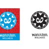
Warrior Personal Training uses Muay Thai (the Thai martial art that includes punching/kickboxing: the Thai call it the “science of eight limbs” ) to train individuals. She is a two-time Canadian national boxing champion turned Muay Thai personal trainer. VISUAL COMMUNICATIONS CHALLENGE: The client wanted the logo to communicate strength; empowerment; respect for the Muay Thai discipline; honour her boxing past; and be a logo that would attract females aged 20-60. SOLUTION: My research showed that Thai graphic design tends to be very busy and textured. In addition, the Thai alphabet and culture has a great deal of curves and swirls, which, in our culture, are considered very feminine. The “W” represents “Warrior” and is designed to conjure the image of a woman in a boxing stance -- to honour the client’s background. The lotus flower shape is very Thai and the 8 points in the flower echoes the eight points of contact for Muay Thai. The words on the outside mean “Strength” in Thai. The texture surrounding the logo honours the Thai design tradition of patterns and fullness in their culture. RESULTS: The client has exceeded all of her marketing objectives for signing up women to train with her and receives continual compliments and notice of her logo.

Award of Merit

RStinson Detail
Name:
Ryan Stinson (Saskatoon)
Organisation:
zu
Title:
SaskCareers Logo
Client:
Saskatoon Industry Education Council
Client’s Business:
Education/Career Planning
Rationale:
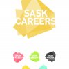
SaskCareers is a web service currently in development that will assist users throughout the province to discover Saskatchewan based career opportunities by offering personal assessments as well as education and training options and recommendations. Considering that the demographic for this service is 13 - 30 year olds living in Saskatchewan, we wanted to create a fresh take on a Saskatchewan related mark. The development of the SaskCareers logo was influenced by the idea that not all education/career paths are linear. This textured treatment uses different values of colour to help create a topographical influenced view of the shape where it in turn hints at peaks and valleys. The unique form of the mark was created by overlapping three layers of the shape of our province, each layer representing one of the three main functions of the service — learning more about yourself, exploring education and training options, and discovering careers.
TAP - Ens Rebranding – Logo Detail
Name:
Tim Neal (Saskatoon)
Organisation:
Tap Communications
Title:
Ens Rebranding – Logo
Credits:
Tim Neal (Creative Director) David Melashenko (Art Director) Pamela Cradock (Copywriter) Rebecca Harbin (Designer)
Client:
Ens Lexus Toyota Scion
Client’s Business:
Automotive Dealership
Rationale:
THE CHALLENGE: Create a distinctive and multi-use identity for a growing automotive dealership.
THE BRIEF: With an ever increasing competitive landscape, and the growth of their business, Ens needed to update their Corporate Identity. Ens’ focus on cars is essential to their brand, and we also needed to deliver a distinctive look that worked with the Toyota Corporation’s visual identity.
THE DELIVERY: Ens is a dealership with 3 vehicle brands (Toyota, Lexus, and Scion) and 3 divisions (Automotive, Collision, and Industrial), so an adaptable layout was essential to maintain a consistent look for all of their businesses. The logo was developed to work as a flat 2D delivery, a static 3D delivery, and as an animated 3D delivery. Since auto dealers are known for their love of merchandise, this logo has been tested and has passed in all applications, from embroidery to engraving. It maintains its distinctive and easy to recognize look throughout all of them.
Phoenix - Prairie Breast Cancer Rehabilitation Centre Logo Detail
Name:
Laila Haus (Regina)
Organisation:
Phoenix Group Advertising
Title:
Prairie Breast Cancer Rehabilitation Centre Logo
Credits:
Design/Art Direction: Laila Haus Creative Direction: David Bellerive
Client:
Prairie Breast Cancer Rehabilitation Centre
Client’s Business:
Health and Wellness
Rationale:
Develop a new identity highlighting the prairie home, and the journey of rehabilitation and health.