
Category : Brand / Identity Application
Delivery of logo and/or corporate branding elements in static and/or dynamic formats. Demonstrative application and usage.
< Back to Categories
![]()
Name:
Breanne Seymour (Saskatoon)
Organisation:
MGM Communications
Title:
Lawson Height Mall Rebrand
Credits:
Art Director: Breanne Seymour
Client:
Lawson Height Mall
Client’s Business:
Shopping
Rationale:
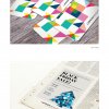
Lawson Heights Mall was moving forward in many ways. With building expansions, new and exciting stores opening, and a freshly renovated interior, it was time to take the Lawson Heights brand to a whole new level. The shapes can be transformed and organized into different organic patterns. The colours, patterns and textures of the shapes follow the latest trends of the season, keeping the brand updated, modern and always in style. The squares and triangles symbolize the coming together of people, whether to socialize, shop or mingle – a core customer benefit of the Lawson Heights experience. The shapes represent movement, different personalities and the various stores Lawson Heights houses.
Name:
Nicole Lock (Saskatoon)
Organisation:
Makeroom Design Shop
Title:
Filling In 4 You Logo & Brand Design
Client:
Filling In 4 You
Client’s Business:
Dental temp placement agency
Rationale:
Filling in for you is a dental temp placement agency providing personnel to dental offices all across Saskatchewan. The objective of the brand design was to build a cohesive image across all print and web media. The business is based on distributing the print material, which directs the customer to the website. Consistency was the key. The colour palate is simple and recognizable, with a common graphic language across all media and a logo that takes different forms depending on the application. The logo focuses on the use of the integer '4' as a stand in for the word 'for', taken from the company’s name. The '4' subdivides the shape of a tooth adding interest to an easily recognizable icon of the Dental profession. The lines that split up the background of all the media are based on the lines that project outward from the lines of the number 4.
Project Link:
Name:
Brian Kachur (Saskatoon)
Organisation:
University of Saskatchewan
Title:
U of S Branding Guidelines
Credits:
Malary Cloke (designer)
Brian Kachur (lead designer)
Colleen MacPherson (writer)
Teri Parkhurst (writer)
Client:
University of Saskatchewan
Client’s Business:
Post-secondary education
Printer:
Mr. Print
Rationale:
The U of S is a complex, decentralized organization that requires well-organized, clear and interesting guidelines for our numerous communicators to use. These guidelines were intended to capture our visual, verbal and editorial style elements in one co-ordinated collection, thereby increasing consistency across campus and streamlining the process by which communications and marketing pieces are created.
The guidelines were and continue to be shared with key stakeholders on and off campus, including marketing and communications professionals; leaders such as deans, department heads and directors, all the way up to the President’s Office; and external suppliers that do work for the university.
This project has resulted in greater uptake of the U of S brand, fewer incidents of non-compliance (e.g., using the incorrect logo) and an increased understanding of the brand expectations.
Although print copies of the guides were issued, many people also access them online, especially initially, as we launch them electronically (resulting in faster accessibility) while simultaneously carrying out the physical distribution. For the initial days after launching the visual guidelines, some of the numbers from the communications site included:
• Compared to the week previous, our page views increased by 100%
• From the month previous they increased by 176%
• Compared to the week previous, visitors successfully completed the goals we have set up by 102%
• From the month previous, goals increased an amazing 400%
• Our brand page views also increased by 353% from the week previous

Name:
Christopher Dally (Saskatoon)
Organisation:
Ledbetter Communications
Title:
Aurora - ID
Credits:
Website programmer - Andrew Scott
Website Copywriting - Leanne Nyirfa
Client:
Aurora Reproductive Care
Client’s Business:
Reproductive Health Care
Printer:
Joanne Kachur - MisterPrint
Rationale:
Aurora Reproductive Care opened it's doors in May 2013 and needed a variety of tools and documents to help create and professional and consistent feel for their patients. Products that were created include, but aren't limited to, BCs, LH, ENV, Fact Sheets, Consent Forms, ID Tags, Policy Manuals, Internal and External Signage, Wayfinding, Postcards, Ads, Pullup Banners, Brochures, and Fee Schedules. The response to both the company and the look and information provided to patients, has been very positive.
Project Link:
Name:
Cheryl McDougall (Saskatoon)
Organisation:
OneOliveDesign
Title:
Sakitawak Branding
Client:
Sakitawak Development Corporation
Client’s Business:
Northern Saskatchewan Business and Community Development Corporation
Printer:
Mister Print - Darlene Danyliw
Rationale:
Sakitawak Development Corp had an established logo, but needed a brand refresh and to establish a consistent brand message across all materials. The new brand needed to improve communications within their community of Ile-a-la-Crosse as well as externally to partners and friends. The new graphics are meant to represent the vibrant colours, shapes, and movement of Saskatchewan's northern forests and communities.
Project Link:
Name:
Roberta Barrington (Saskatoon)
Organisation:
Barrington Creative
Title:
Evening Under The Stars Identity
Credits:
Roberta Barrington (Creative Director & Designer)
Client:
St. Paul's Hospital Foundation
Client’s Business:
Charity
Printer:
PGI Printers
Rationale:
This identity was created for a new fundraising event initiative by St. Paul's Hospital Foundation that benefits St. Paul's Hospital's Palliative Care Unit. The concept for the event included the Saskatoon Symphony Orchestra fused with live, outdoor classic rock performances on a summer evening during a full moon on Dakota First Nations land. It was asked that the identity take all of these elements into consideration while remaining clean, clear and cohesive. The nuances of the typography and logo lock-up denote optimism, energy, culture and creativity. The colours represent dusk, a starry night sky and a full blue moon. Comprehensive identity guidelines were also produced for communicating hierarchy, colour palette, spacial relationships and proper use of the primary, secondary, one-colour, and reversed logo lock-ups.
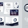
Name:
Matty O'Connell (Regina)
Organisation:
Look Matters
Title:
Zaba Brand Identity
Credits:
Art Director: Kaitlyn Rude
Client:
Zaba Financial
Client’s Business:
Financial Planning
Rationale:
Zaba Financial Group is a family operated financial planning company consisting of a father and two sons. The group specializes in working with clientele of all ages and generations, most specifically families. It was our goal to develop an identity for the client that would set them apart from other financial groups in Saskatchewan and would showcase their specialty in working with families of all generations. Their logo needed to be a visual representation of three generations working cohesively. It also needed to exude a level of professionalism and steadfastness. The thumb-nailing of these requirements produced an icon of three lively waves coming together to evoke a sense of togetherness and protection. The three shades of blue were chosen to further represent the generations. A branding package, including different usages of the logo, letterhead and business cards was completed for them, as well as an impression booklet that included custom photos of each employee and brief descriptions of their values and practices.
![]()
Name:
Jeanie de Beer (Saskatoon)
Organisation:
Createbyfaith Branding & Advertising
Title:
Beyond Measure Design
Credits:
Creative Director: Jeanie de Beer
Copywriter: Gillian D’achada
Client:
Beyond Measure Design
Client’s Business:
Architect, Home Design
Rationale:
Design that sets your life free.
This inspired the choice of the name Beyond Measure Design five years ago. CBF not only honored that name, but extended it to its logical conclusion within the brand concept.
through all customer touch-points, from a new logo, to stationery material to a beautiful website that rounds out the brand.
This inspired the choice of the name Beyond Measure Design five years ago. CBF not only honored that name, but extended it to its logical conclusion within the brand concept.
through all customer touch-points, from a new logo, to stationery material to a beautiful website that rounds out the brand.
Project Link:
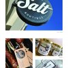
Name:
Steven Safruik (Regina)
Organisation:
Bravo Tango Advertising
Title:
Salt Food Boutique - Identity
Credits:
Design: Bravo Tango Advertising - Dean Fleck
Client:
Salt Food Boutique
Client’s Business:
Specialty Foods
Rationale:
Salt food boutique is Regina's first charcuterie (dedicated to the art of curing meats and other handmade fare). Bravo Tango designed a simple yet bold logo that allows the handmade foods to be the hero and gives a nod to the traditional, handmade nature of all the foods they produce in store.
Production costs of all packaging and printed materials were kept to a minimum by printing one colour on craft and butcher paper, as well as utilizing a system of standard labels that could be hand-written on and applied to various jars and packaging.
The bold, black and white colour palette is used consistently across store materials, and applied to everything from unique typographical murals to the employee t-shirts.
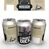
Name:
Shane Ostrander (Saskatoon)
Organisation:
The Marketing Den
Title:
Specklebelly Beer Labels
Credits:
Art Directors: Shane Ostrander, Eric Marchildon, Ryan Schmidt Copywriter: Traci Lowe
Client:
Specklebelly’s
Client’s Business:
Brewing Company
Rationale:
The new owners of Specklebelly's Brewing Company wanted to update and refresh their brand with a new design, and new names for their microbrew beer. Specklebelly's is located in the historic area of Sutherland in Saskatoon, which is known for the railway that runs through the middle of it. The new identity retained the Specklebelly's name, but the design tapped into the history of the location with a vintage train imagery, and modern vintage typefaces incorporated into the design.
The microbrew beer market is highly competitive, and we needed our labels to grab people's attention, and create a unique position in the market. To do this, the beer were named after old railway terminology to embrace the history of the location in a unique and slightly suggestive way, and the design has a modern vintage look and feel. Copy on the bottles includes a definition of the beer's name, and a food pairing to enhance the drinking experience.
The microbrew beer market is highly competitive, and we needed our labels to grab people's attention, and create a unique position in the market. To do this, the beer were named after old railway terminology to embrace the history of the location in a unique and slightly suggestive way, and the design has a modern vintage look and feel. Copy on the bottles includes a definition of the beer's name, and a food pairing to enhance the drinking experience.