Delivery of the event’s branding elements in static or dynamic formats. Examples should demonstrate a minimum of 3 media which can include: Invitations, Posters, Microsites, Social media, etc.

< Back to Categories

MGM - Zoogala Event Materials 2013 Detail
Name:
Breanne Seymour (Saskatoon)
Organisation:
MGM Communications
Title:
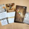
Zoogala Event Materials 2013
Credits:
Art Director: Breanne Seymour
Client:
Zoogala
Client’s Business:
Fundraising
Rationale:
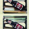
Organized by the Saskatoon Zoo Foundation, Zoogala is one of the city’s most prominent fundraising events, aimed at improving the exhibits and programs at the zoo. While dining on delicacies and celebrating the culinary mastery of top chefs are tantalizing aspects of Zoogala, the intent was to focus on the real reason for this event: the animals. Seeing a pair of furry paws clutching a glass of chardonnay or claws wrapped around fine silverware helps us remember that maybe we’re not really all that different from our furry friends; we all need to eat!
OneOlive - WIUGC 2014 Conference Materials Detail
Name:
Cheryl McDougall (Saskatoon)
Organisation:
OneOliveDesign
Title:
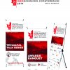
WIUGC 2014 Conference Materials
Credits:
Copywriter: Adrienne McDougall
Client:
WIUGC 2014
Client’s Business:
Student-run Geosciences Conference
Rationale:
The Western Inter-University Geosciences Conference (WIUGC) is a student-run conference that allows undergraduate and graduate students to; meet industry professionals, discuss new technologies, and gain insight of the industry. The event logo and materials needed to represent western Canada, specifically the 2014 host-city Calgary, as well as attract students of geology and geophysics from Saskatchewan, Alberta, and British Columbia.

People’s Choice Award

Roberta B - The Pink Wig Gala Detail
Name:
Roberta Barrington (Saskatoon)
Organisation:
Barrington Creative
Title:
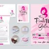
The Pink Wig Gala
Credits:
Roberta Barrington (Creative Director & Designer)
Client:
The Pink Wig Foundation
Client’s Business:
Non-Profit
Printer:
PGI Printers, WaxSeals.com
Rationale:
The Pink Wig Foundation required communications for it's second annual fundraiser gala event. The gala was to be held in the prestigious Delta Bessborough Adam Ballroom. The communications needed to look as illustrious as the venue while still staying in step with the foundation's visual identity and personality. An event logo was developed and applied to UV-spot printed envelopes and folded invites complete with custom wax seals as well as across social media, print advertising, and signage at the event.

Elevator AwardJudge’s Pick

TAP - Heavy Lifting – 2012 Elevators Awards Detail
Name:
Tim Neal (Saskatoon)
Organisation:
Tap Communications
Title:
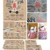
Heavy Lifting – 2012 Elevators Awards
Credits:
Tim Neal (Creative Director) David Melashenko (Art Director) Pamela Cradock (Copywriter) Rebecca Harbin (Designer)
Client:
GDC SKN
Client’s Business:
Professional Association
Rationale:

The Challenge: Create an array of materials for the pickiest of all audiences.

The Brief: The GDC is a member-based organization of design professionals, educators, administrators, students and associates in communications, marketing, media and design-related fields. Every two years, the Elevators award local design that shows creative excellence, educates the public and promotes discussion about the role of designers in Saskatchewan. In partnership with the Elevators committee, we needed to plan and coordinate every part of the 2012 event – from the theme to the giveaways.

The DELIVERY: We chose to focus on the responsibility and work of designers in the overall design process. The “Heavy Lifting” event theme we developed has several meanings, but most importantly it’s about the need for extra effort at some point in the process of creating design and advertising. We asked the judges/speakers to incorporate this theme into their speeches to make the experience even more cohesive and memorable. We wanted the event to be fun, so we developed a quirky “mascot” (AKA - Mucho Macho) and visual element that would resonate with our audience. Every element of the design was hand drawn to focus on craft and simplicity. The poster was printed in a limited run silkscreen, on recycled kraft paper. The program was designed so the information could exist on one side of the paper while other side unfolded into an event poster. It was also used as a promotional/advertising piece.

Award of Merit

Kinetic - The Local Bar Detail
Name:
Giles Woodward (Saskatoon)
Organisation:
Kinetic Advertising
Title:
The Local Bar
Credits:
Account Manager – Lori Leach, Creative Director – Giles Woodward, Art Director – Graeme Zirk, Production Artist – Jamie Tremblay, Copywriter(s) – Graeme Zirk & Lori Leach
Client:
MacPherson Leslie & Tyerman LLP
Client’s Business:
Law Firm
Rationale:
This year, the Canadian Bar Association’s Annual Conference was held in Saskatoon, creating the opportunity to plan and brand an event for MLT lawyers, The Local Bar. Using clever wordplay, a legal theme was incorporated into each brand touch point in combination with colloquially relevant imagery and objects.


The result was a cleverly crafted identity and atmosphere that dispelled some of the misconceptions metropolitan Canadians have about the prairies — Saskatchewan is an interesting, growing, professional province.
Ryan Schmidt - Design Week 2013 Detail
Name:
Ryan Schmidt (Saskatoon)
Organisation:
Sparrowhaus
Title:
Design Week 2013
Credits:
Photos: Submitted
Client:
Design Council of Saskatchewan
Client’s Business:
Promoting professional design in Saskatchewan
Rationale:
The Design Council of Saskatchewan is comprised of six professional design associations. Hosting Design Week is a major initiative of the Council. It is an open invitation to the public to learn about the different areas of design through a speaker series. The Council also recognizes design excellence in Saskatchewan through the Premier’s Awards of Excellence in Design which is held in conjunction with Design Week.

The Council debuted a new logo in 2013 and I used the new colours as a jumping off point for the colour scheme of the event. The Design Week logo and DW13 mark were developed with geometric shapes to reference the shapes within the new DSC logo. One of the most exciting things about working on Design Week was the chance to design a custom award for the Premier’s Awards of Excellence. It was created out of solid aluminium water jet cut and machined out by Fabricating Arts.
MarketingDen - 60th Anniversary Awards Banquet Detail
Name:
Eric Marchildon (Saskatoon)
Organisation:
The Marketing Den
Title:
60th Anniversary Awards Banquet
Credits:
Art Director: Eric Marchildon Copywriter: Bronwyn Stoddard
Client:
Saskatoon Transit
Client’s Business:
Public Transit
Rationale:
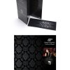
Every year Saskatoon Transit holds a themed Employee Recognition and Awards Banquet. This year Saskatoon Transit celebrated their 100th year of service and their 60th annual Employee Recognition and Awards Banquet. The theme for this special occasion was 1920’s glad rags. An invitation tailored to the theme was developed and sent to all of the ‘Daddies and Dames’ to create buzz and excitement about the event. The program also carried the theme with the same look and feel.
Phoenix - Saskatchewan Roughriders Detail
Name:
Laila Haus (Regina)
Organisation:
Phoenix Group Advertising
Title:
2013 Grey Cup Festival Design
Credits:
Creative Direction: Lee Jones Design/Art Direction: Ryan Dowdeswell and Jared Frey
Client:
Saskatchewan Roughriders
Client’s Business:
Football
Rationale:
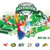
Create an identity for the 101 Grey Cup Festival in Regina that would celebrate the fans, the prairie and the CFL—an identity that teams across the league would feel part of.